Overview
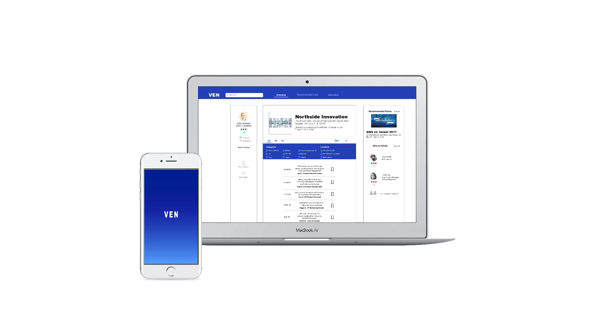
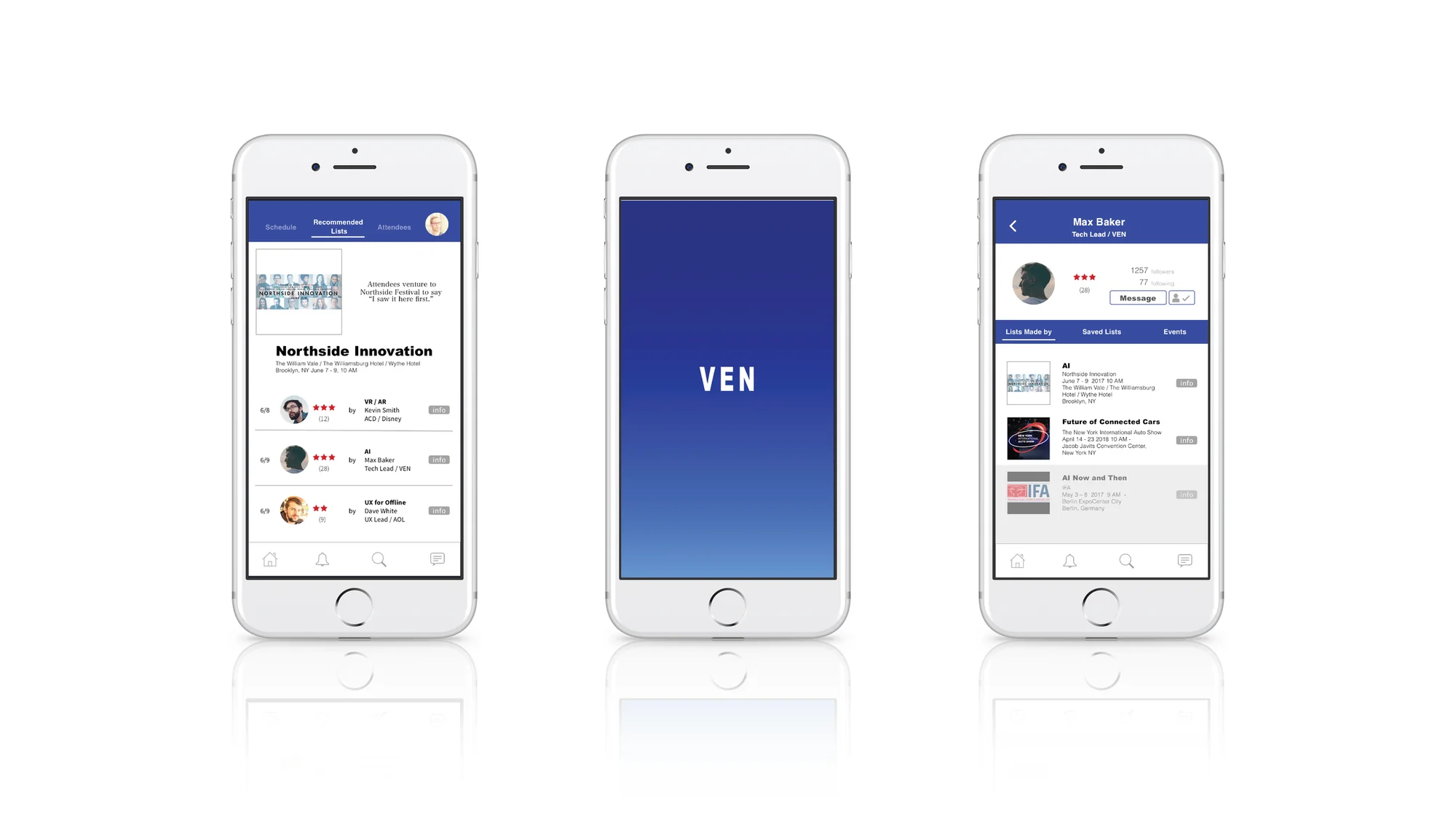
Designed a UX/UI experience for large-scale business events. User research challenged the initial networking hypothesis, leading to a reframed experience focused on helping attendees navigate complex agendas and discover relevant sessions and people. Developed through research, information architecture, prototyping, user testing, and final UI design.
Research
01The first question
“Your Network is Your Net Worth”
You may have heard this phrase. If you haven’t, do you agree?
Connectivity is one of the basic human needs. Technology has made expanding the network and staying connected easy. We live and breathe in a world filled with social media, and many of us are more connected in a personal capacity. But when it comes to networking and connecting in a professional capacity, what do we do?
“How might we increase professional networking opportunities?”
User interviews: How they value professional networking and what they do / think
- Networking is very important
- Allocating “Networking Time” in itself can be difficult
- Attending a business event is a great way to expand a business network, since like-minded people are at the same venue
- Try to be very efficient with time, but there are still idle times during business hours
- Feel they are underutilizing technology to efficiently expand their professional network
- Wish they are doing more
- Tools and opportunities they use: LinkedIn, Facebook, Twitter, Industry events, meetups etc
AssumptionConnecting the right people with an app during their idle time will help busy people to expand a meaningful professional network efficiently.
02What has been on the market
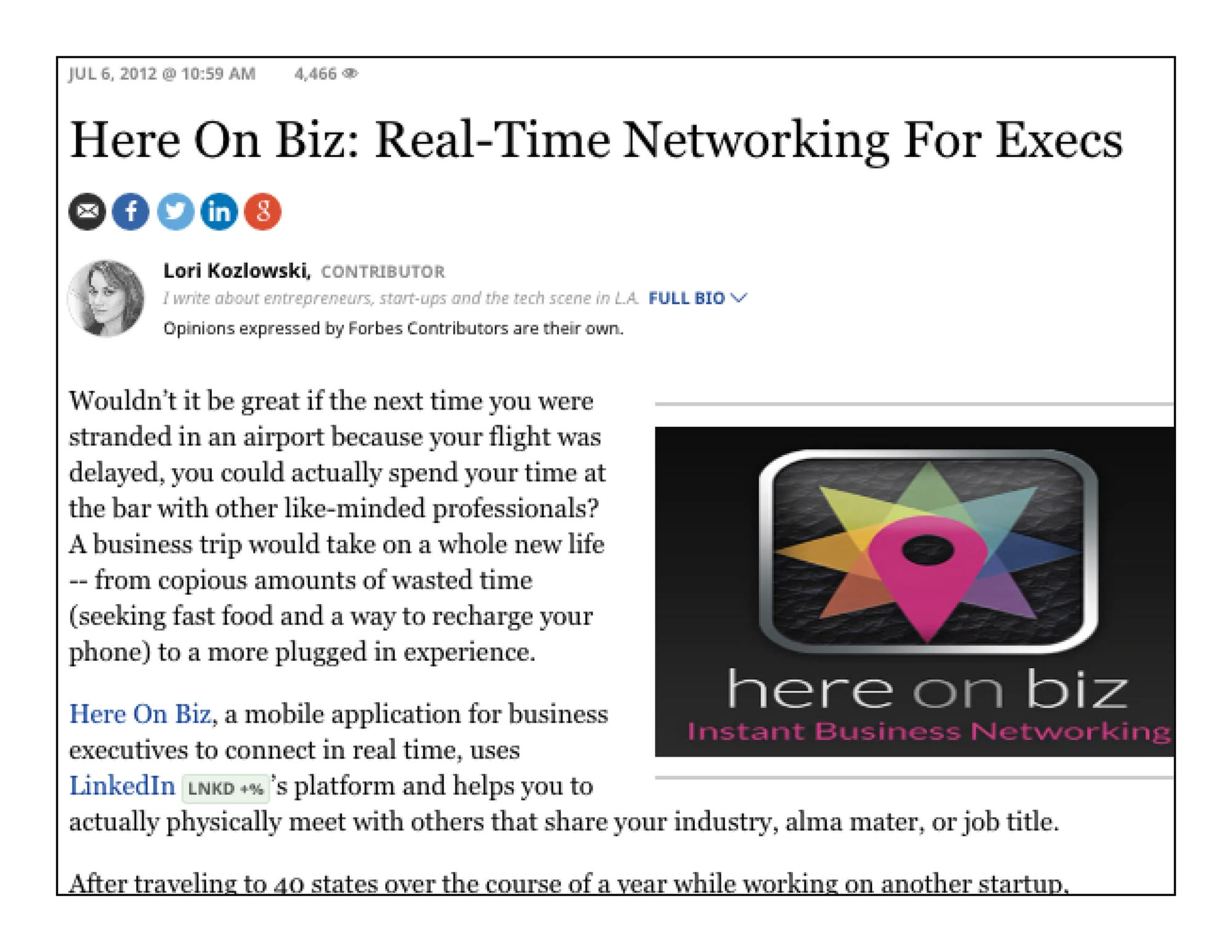
“This product Here On Biz (2012) turn your downtime into a potential business opportunity.”
The app is no longer available
VivaStream “Connect to attendees and information or not at an event.” Found this review from (2012)
The app is no longer available
The company still exists and carries an event data analytics platform, and has deleted the “connecting people” feature
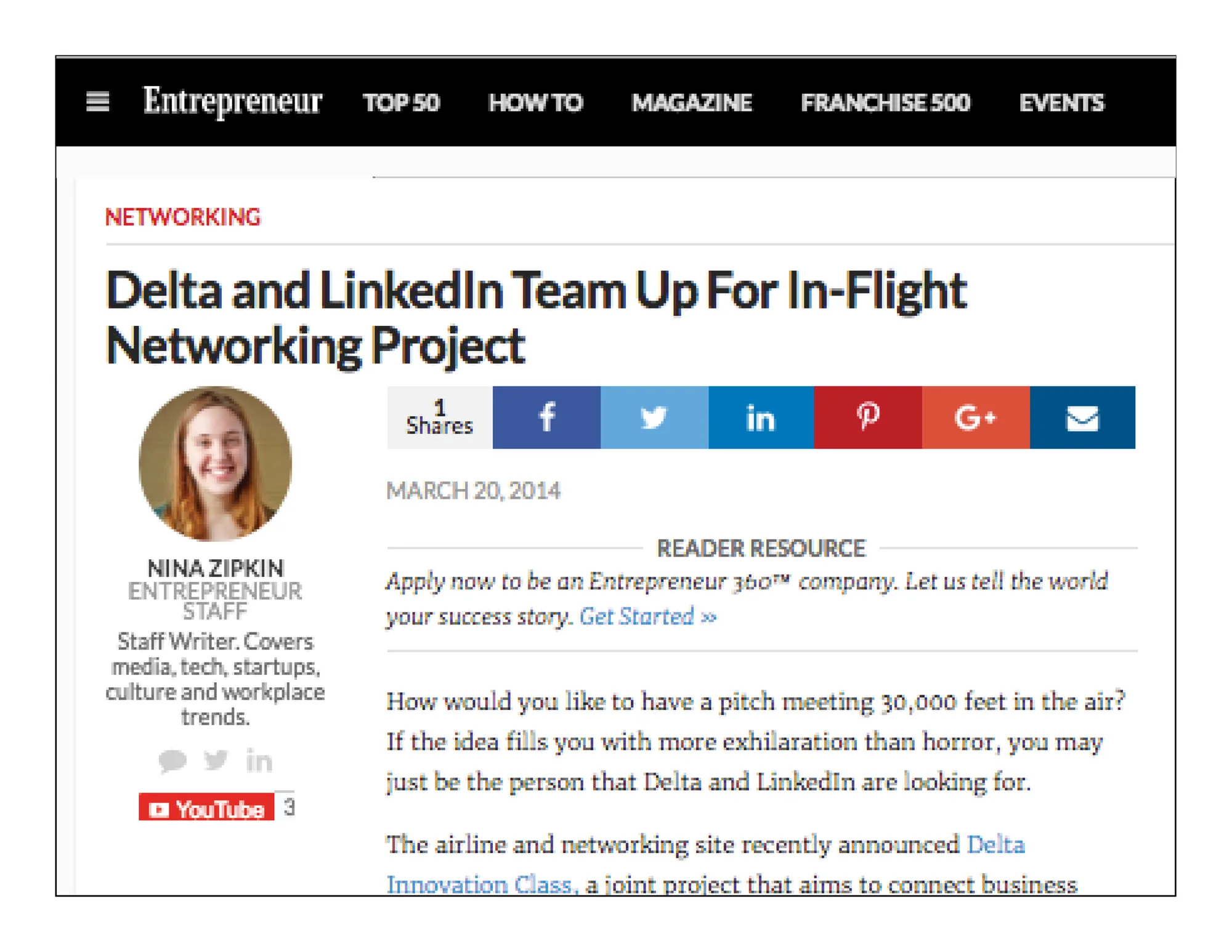
“Delta Innovation Class (2014) by Delta, a joint project that aims to connect business leaders and ‘up-and-coming professionals’ on flights to industry events.”
This project is no longer available

“Shapr - Like LinkedIn, But With A More Intimate, Meaningful Network Of Connections / That’s the idea behind the professional matchmaking app Shapr.”
This app is still available
Interviewees were asked to download Shapr and use it for a week for research purposes
The discovery: Contrary to the app’s decent reviews on app stores, the interviewees didn’t like the concept of expanding their business network by meeting people via the app
- The description/bio does not provide enough information for me to want to “meet” them in person
- Meeting via app is too much commitment considering the potential consequence for my reputation as a professional
- Using and browsing itself takes too much time for something that guarantees no result
- “Connecting” (like LinkedIn) is as far as I feel safe
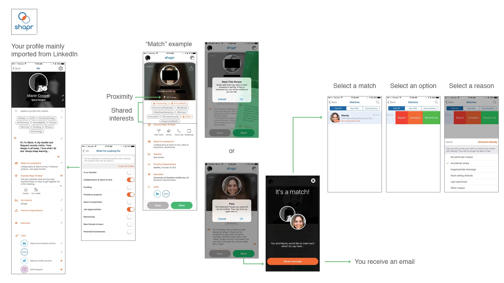
User Flow of Shapr
03Dating apps and networking apps
As the market already told us, professional networking via technology seems to be challenging.
But dating apps, which have similar features, have been successful. Why do the features work for dating apps but not for networking apps?
Because...
Dating app users say
- Browsing itself can be fun = Some seem to enjoy the process itself, not much emphasis on the result
- Meeting itself can be fun even if it doesn’t “succeed” = (whatever the definition might be)
- Don’t need to think much about consequence / reputation
The indication of “a successful app” is measured by how often the users come back. Not necessarily by the success rate per attempt. Since the users’ attitudes and expectations are different for those two categories, applying similar features doesn’t guarantee a successful product.
Because professional networking
- is about building and cultivating a relationship (as opposed to just swiping or clicking)
- involves more subtleties and requires a higher level of communication (way beyond BIO)
This assumption
“Connecting the right people with an app during their idle time will help busy people to expand a meaningful professional network efficiently”
failed
04The question was reframed
So further interviews were conducted around these findings from the previous interviews
- Networking is very important
- Allocating “Networking Time” in itself can be difficult
- Attending a business event is a great way to expand a business network, since like-minded people are at the same venue
The discovery - They expressed
- Attending a business / industry event is a commitment, want to make the most of it
- But overwhelmed by the amount of information, especially if the event is big.
- Therefore many are forced to spend a significant amount of time on planning which presentations to see and activities to participate in at the event
- Even after carefully making a list of which presentations to see and activities to participate in, they are still not certain if their choices were good = missing better presentations/activities?
- Some extremely busy people just ask their colleagues to share their list, if they are available
Facts - Over 10,000 trade shows / big business events are held every year in the U.S. More than 12.6 billion U.S. dollars in revenue was generated in 2015
So the question was reframed
“How might we improve the experience of planning their agenda for business / industry events?”
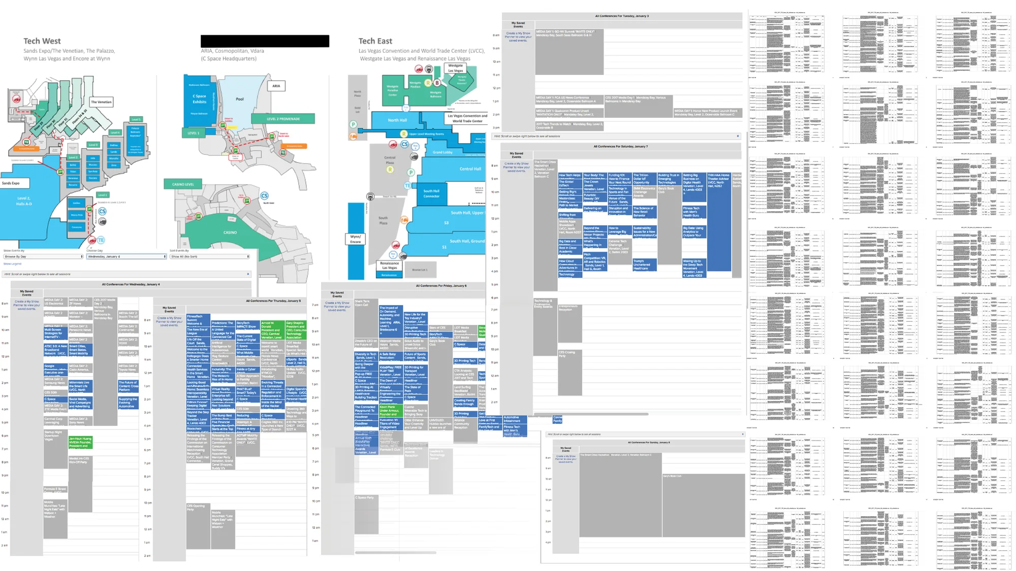
Example - Floor Plan and Schedule of a business/ industry event : More than 4,000 exhibiting companies plus more than 600 startups and exhibit space of more than 2.6 million net square feet, 4 days. Ticket price from $300 to $1700
AssumptionBy creating a product which enables the user to share well-curated lists of presentations to see / activities to participate in with others who are busy, we reduce their stress of planning an agenda ahead of time.
What’s on the market:
- There are no direct competitors
- Sharing lists among friends is popular
- Also there is a thirst for knowing “curated lists” by influencers
- However, no business app provides this feature = Opportunity
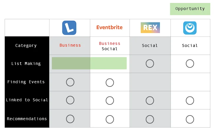
There are no direct competitors on the market. The list contains comparative analysis.
Business Model: Rethinking the ecosystem
- Event attendees as community members - they can help each other
- Share your curated agenda lists for the event with others
- If you’re too busy, reference / copy others’ (influencers or not) agenda lists to save your time
- Quick networking is not the goal
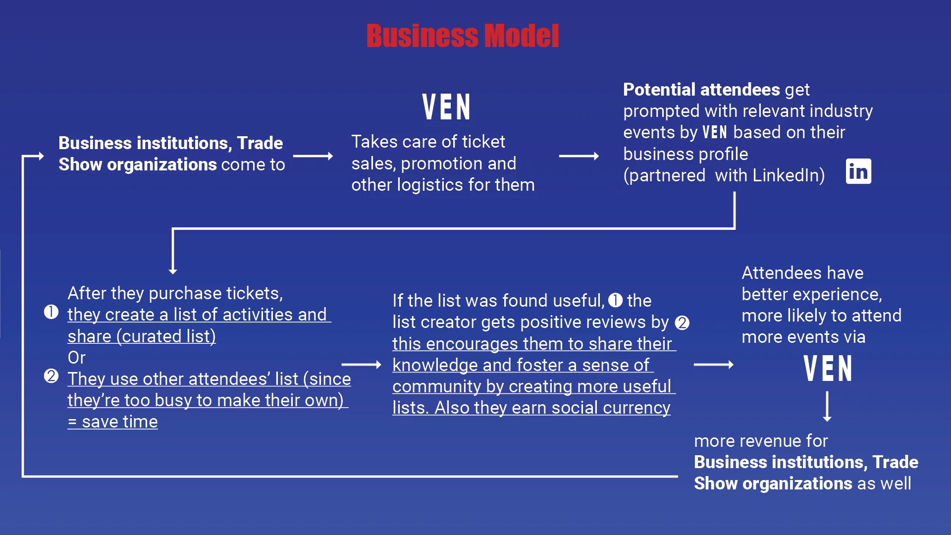
There are not too many key features in the product, but to stay focused on the core product feature and relevant to the assumption, I asked this question.
If the user is asked to describe this product in one sentence, what would they say?
This product is about ______.
This product is about “making / sharing lists for business events”
Process
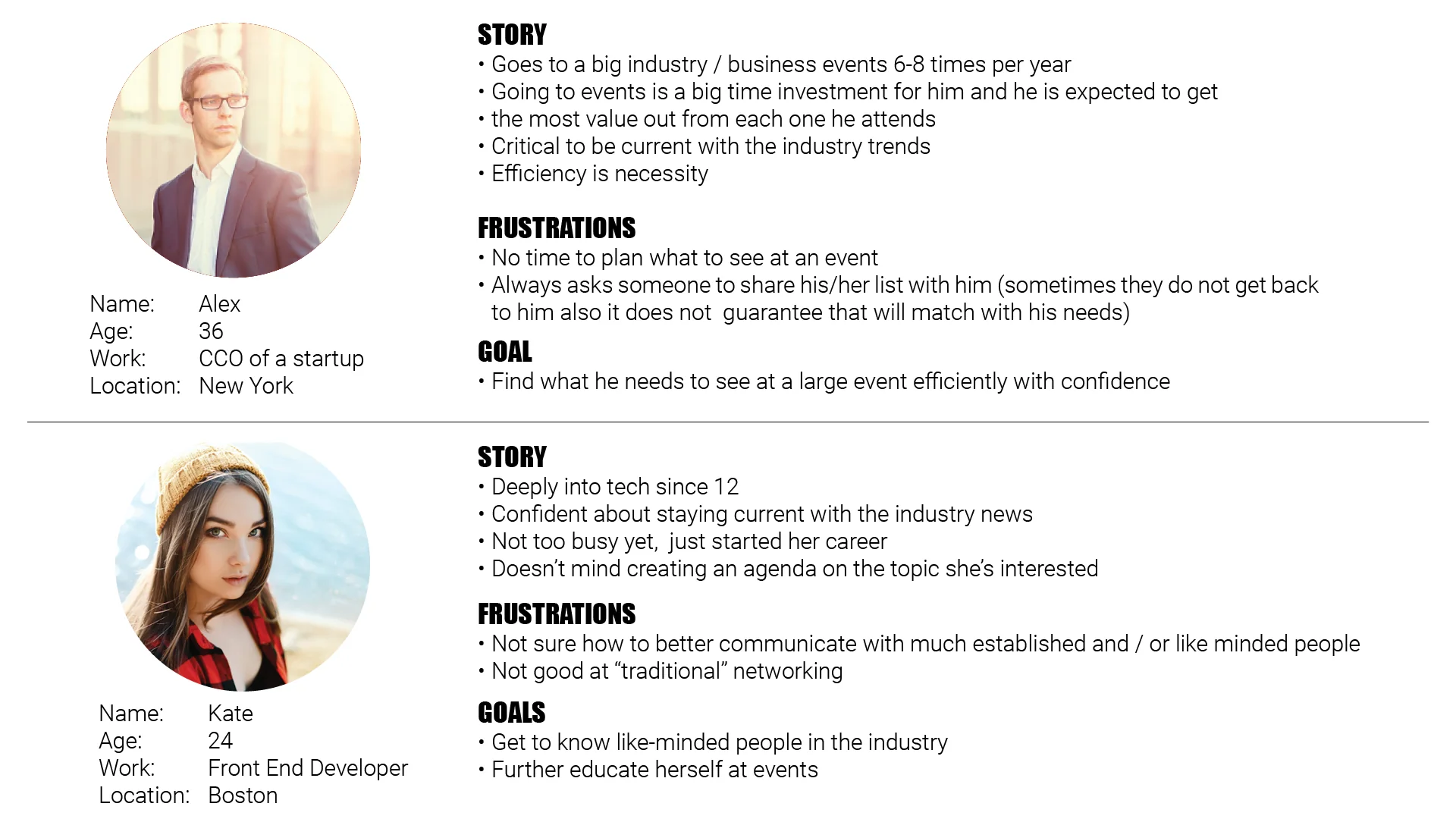
Two types of personas were created:
- Someone who has no time and is looking for a list
- Someone who has time to create a list, doesn’t mind sharing her list with others, and desires to be part of the community
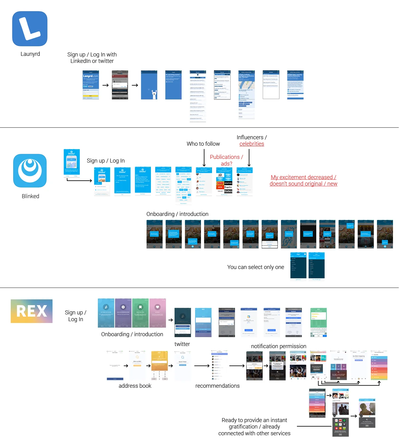
Competitive/ Comparative Analysis:
Notes on usability testing of other list-making or business products. Onboarding and list-making features were mainly analyzed.
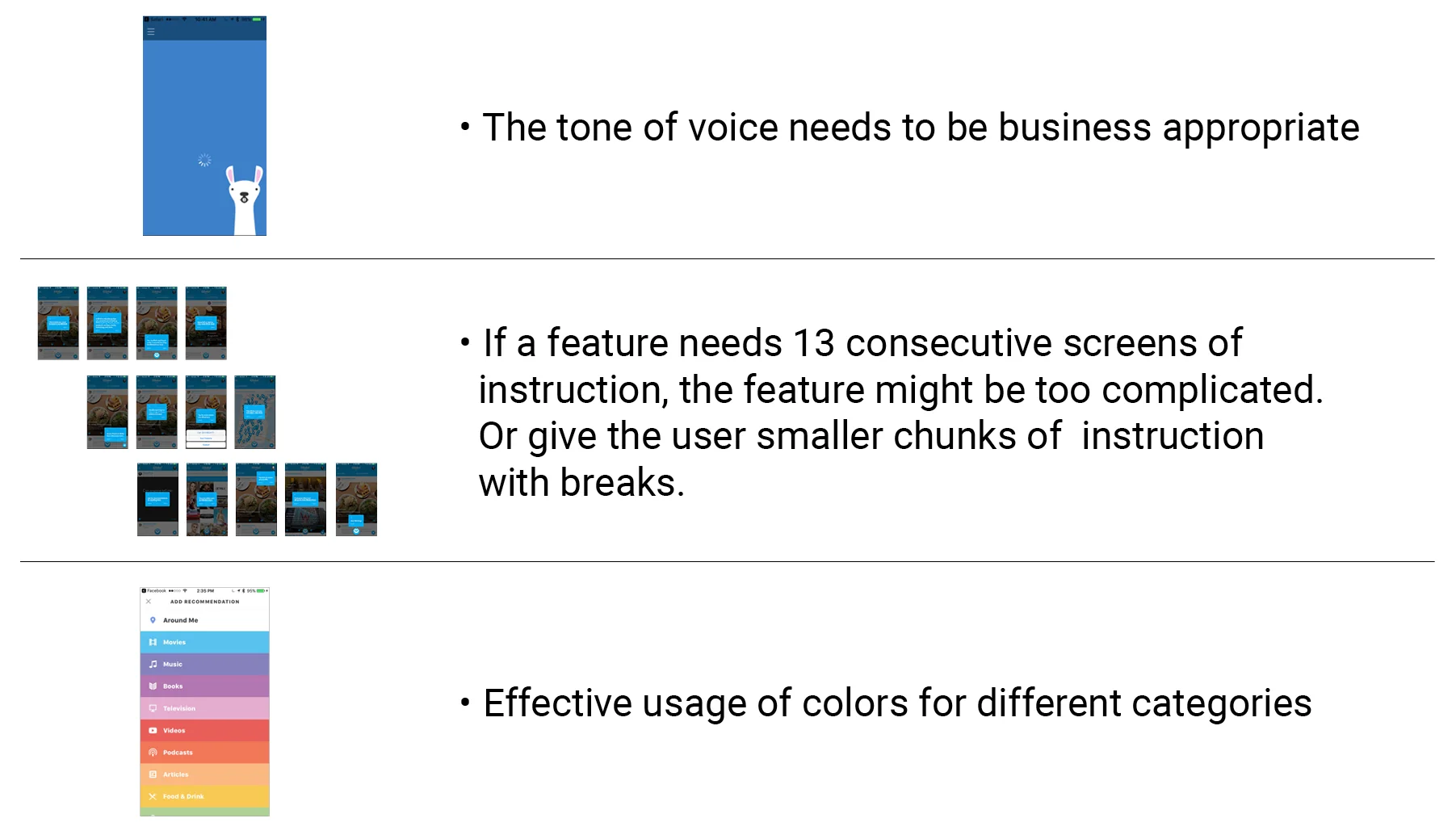
Notes
MVP
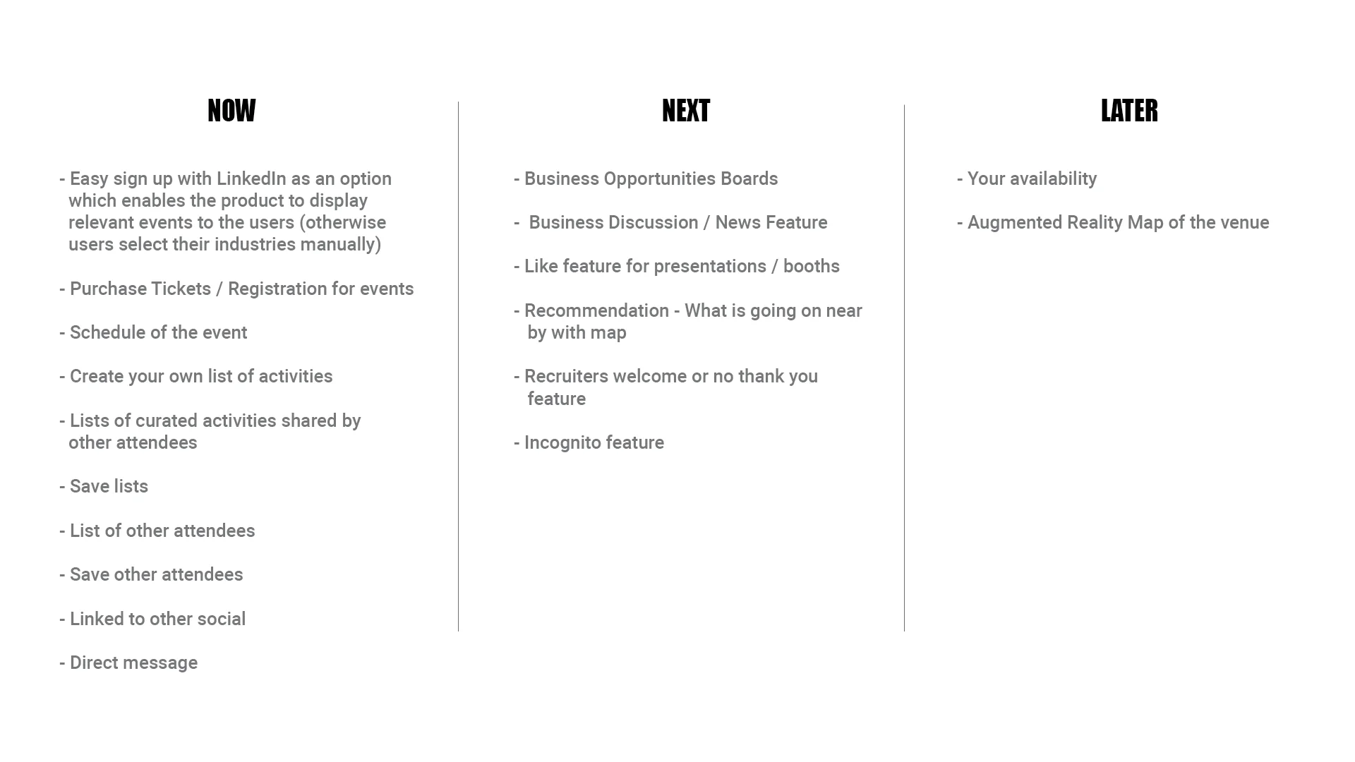
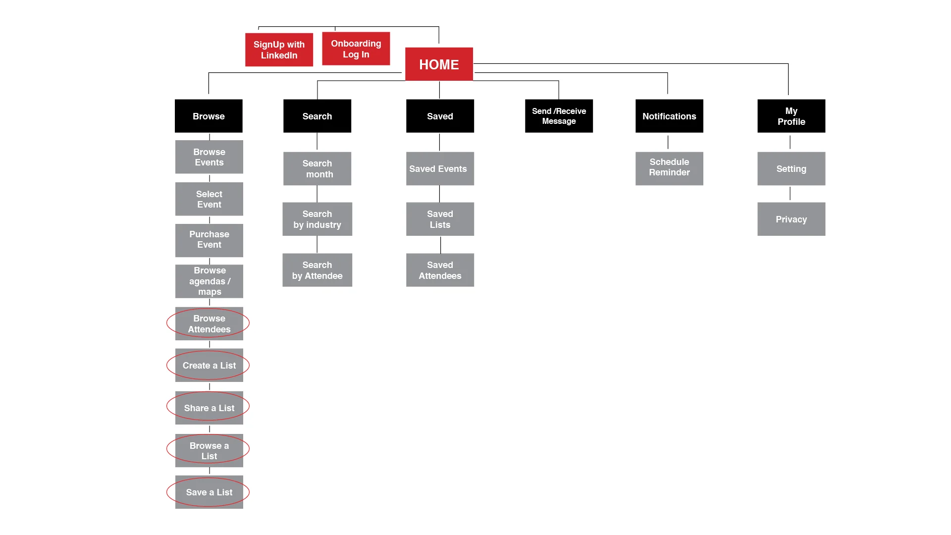
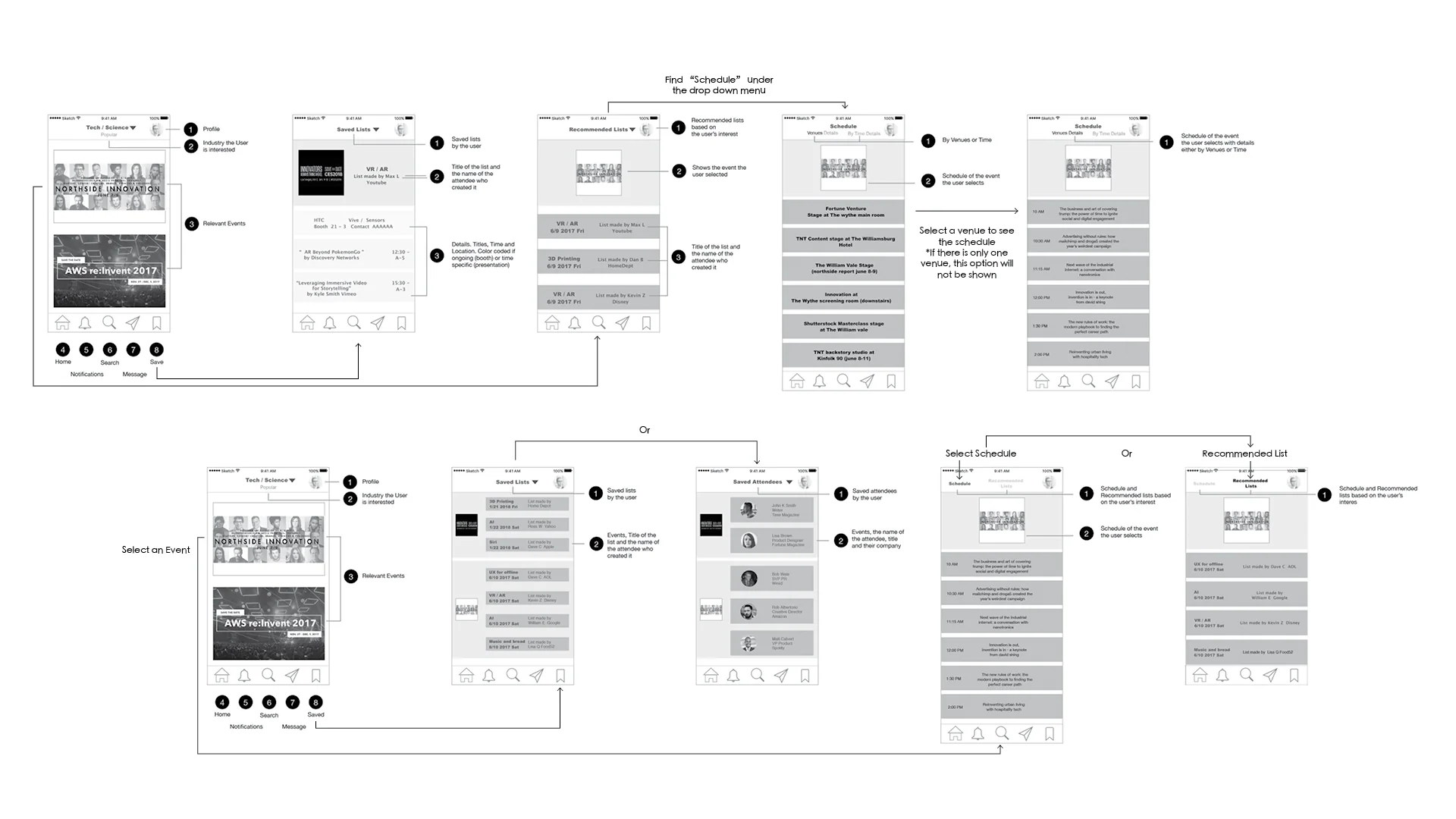
Low-fidelity prototype, IA and user flow chart reflecting key points in the user flow for the user to accomplish tasks with ease:
- Onboarding should contain no more than 5 screens
- The user can make a list after they purchase a ticket
- The users can search other events easily
- The product suggests related events

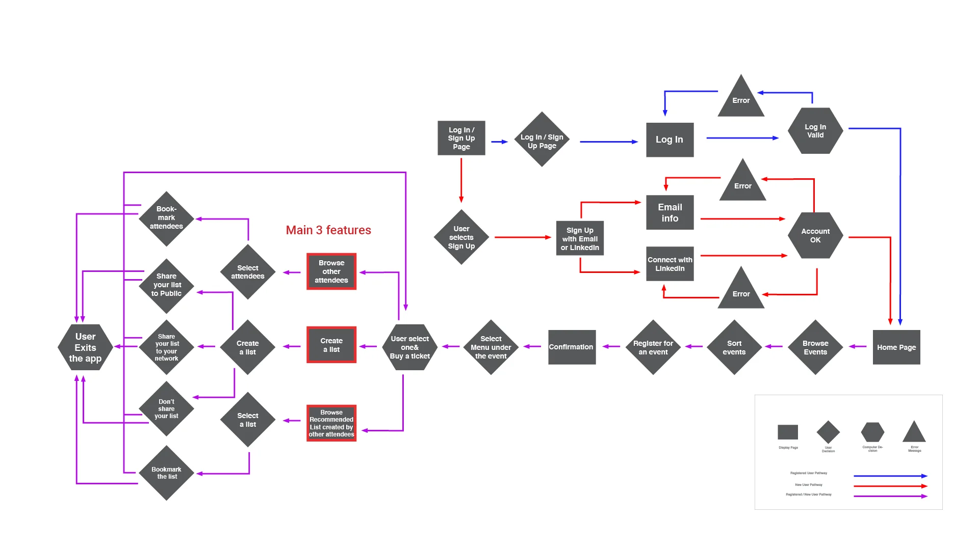
Details were added to this mid-fidelity prototype with annotations, to ensure a smooth user flow.
Key mid-fidelity prototype screens for user testing. Design was more defined from the previous version.
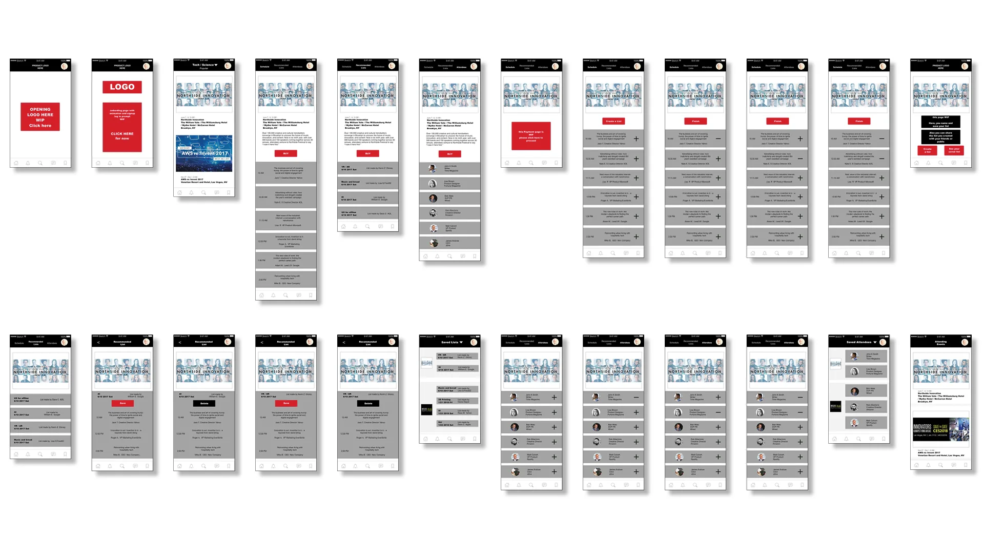
User testing results (selected):
- At the first schedule screen, the image is rather large and it requires scrolling down = more action
- Nice to have a more noticeable cue which indicates which menu I’m looking at
- What’s the difference between “+” and “save” icons?
(Iteration 1) User testing results were reflected in this version, and color codes were added for different industries.
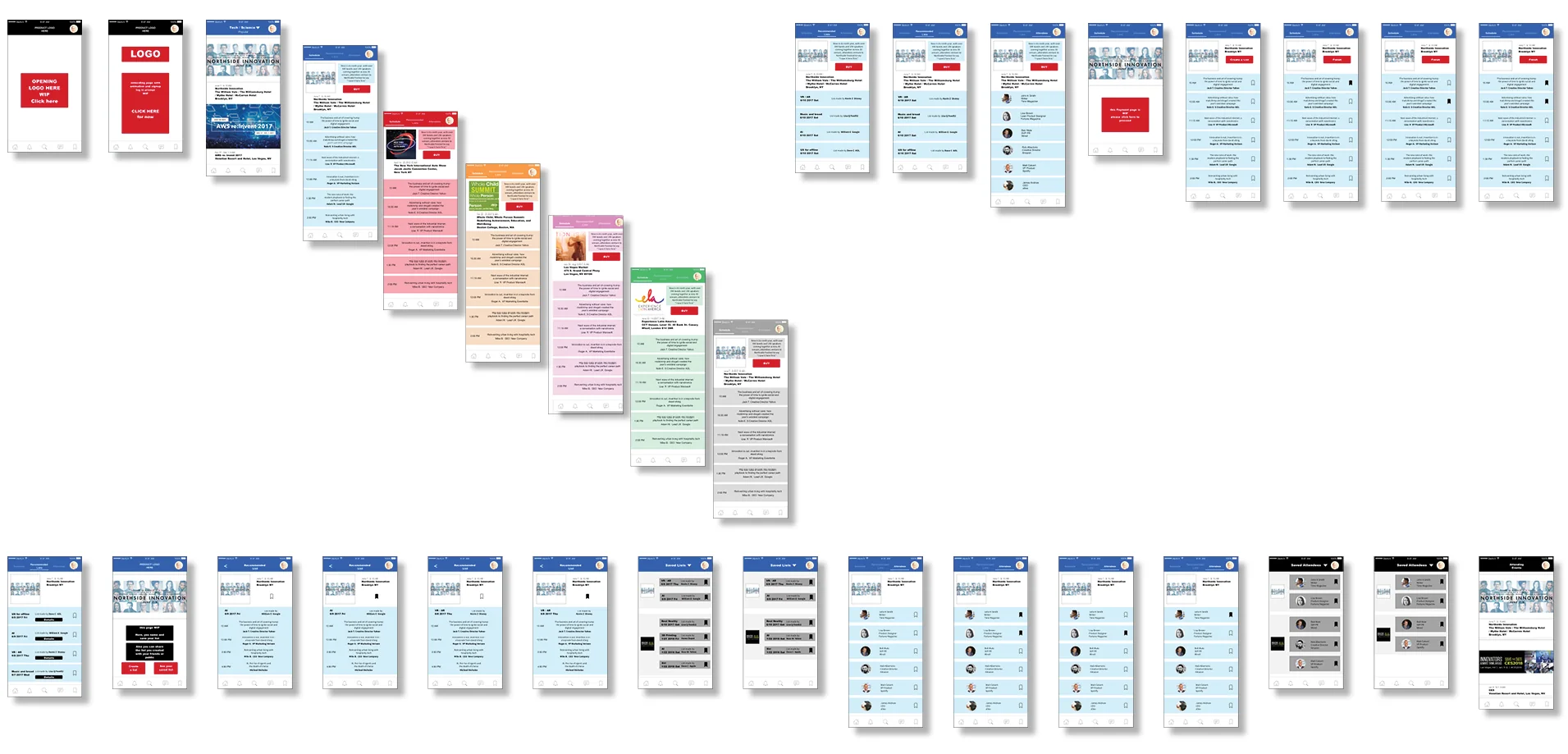
User testing results (selected):
- “Details” and “Save” buttons could appear in two different screens. They fight for my attention, (the screen) lacks clarity
- Color coding for each industry seems to be unnecessary, especially for a Business product
Final Design
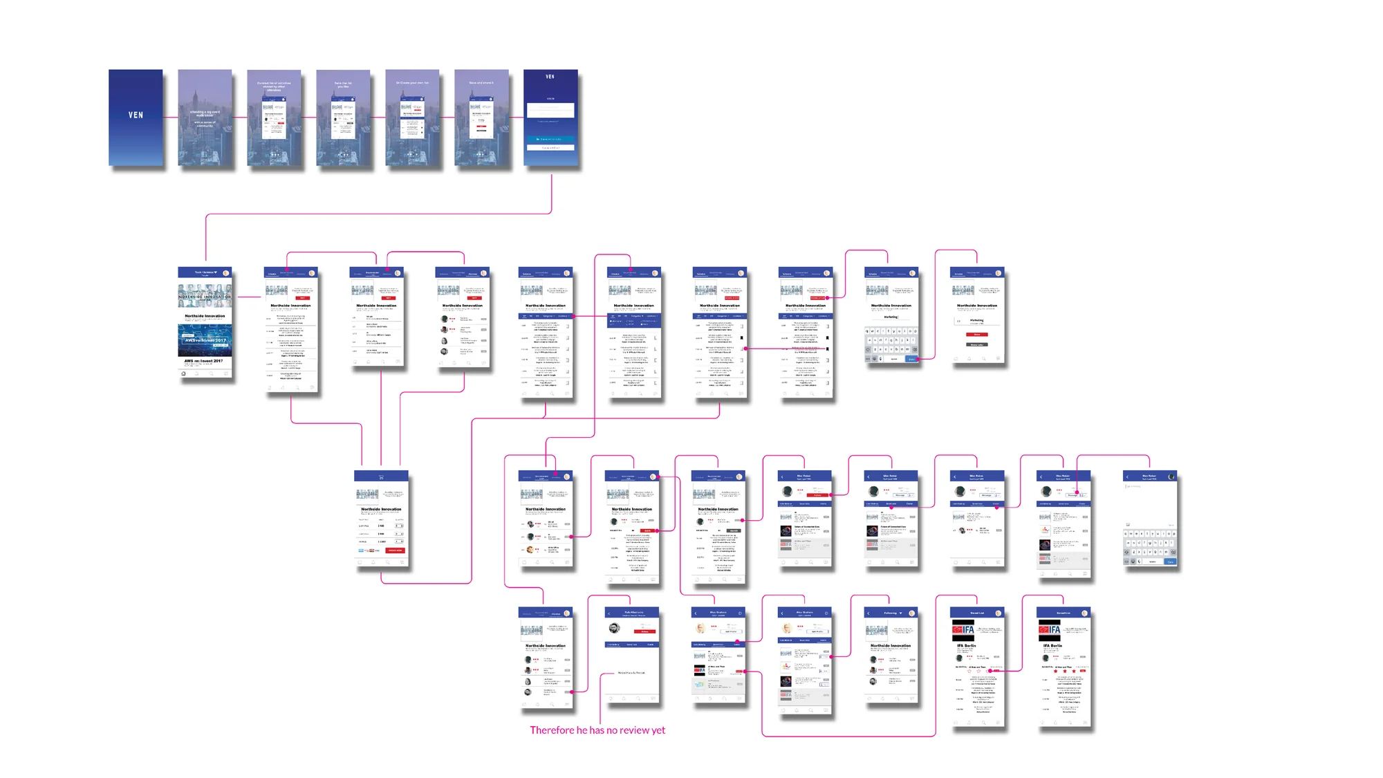
Details of iterations
1. The testers expressed that the multiple colors used in the prototype were not enhancing the user experience but rather distracting. Therefore the usage of different colors was minimized.
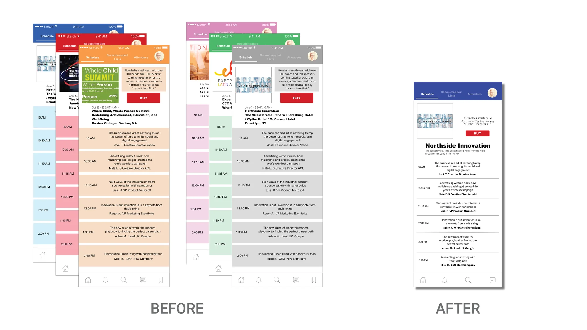
2. Changed the design of the schedule screen so that details will be visible without scrolling down.
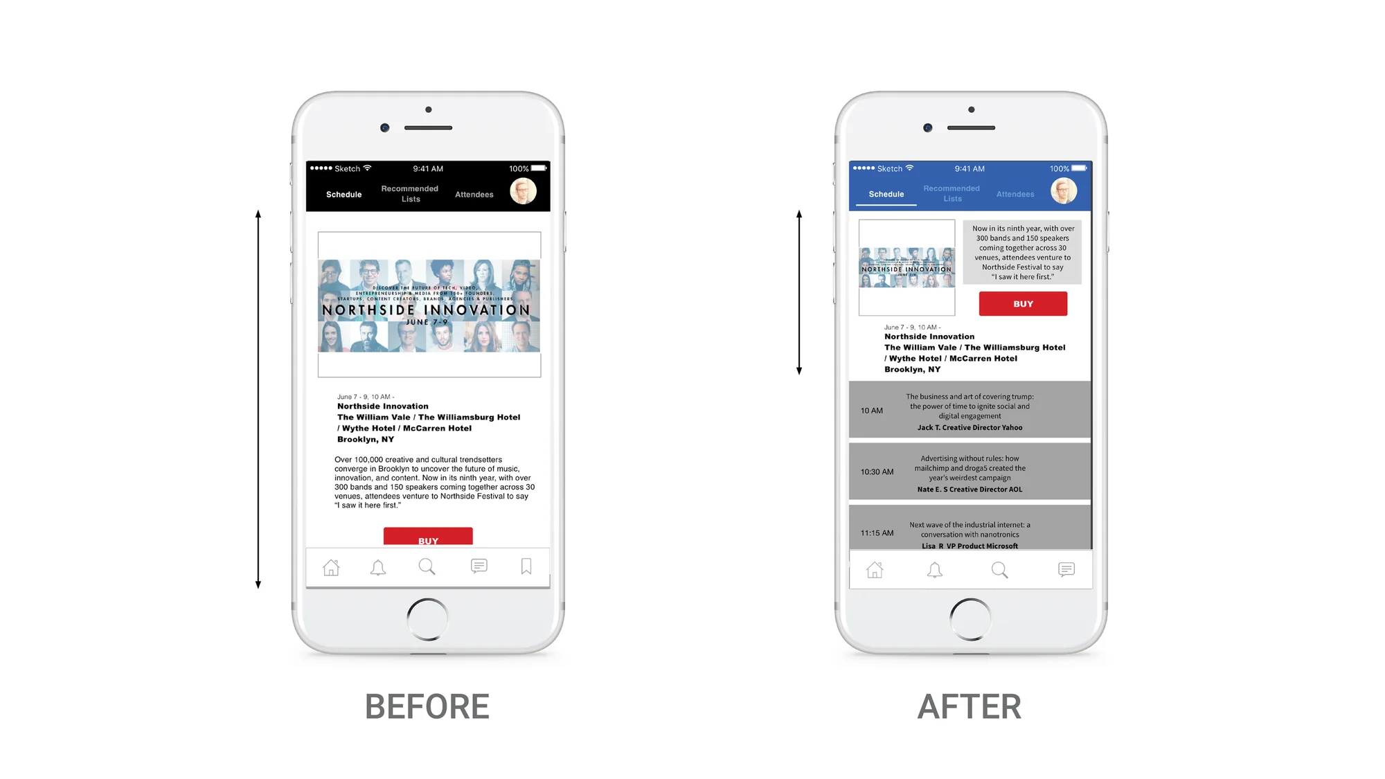
3. Fewer screens don’t guarantee a better user experience. “Details” and “Save” icons are now on two different screens so that the user sees one key action button on one screen; those items don’t fight each other for the user’s attention within the limited space.
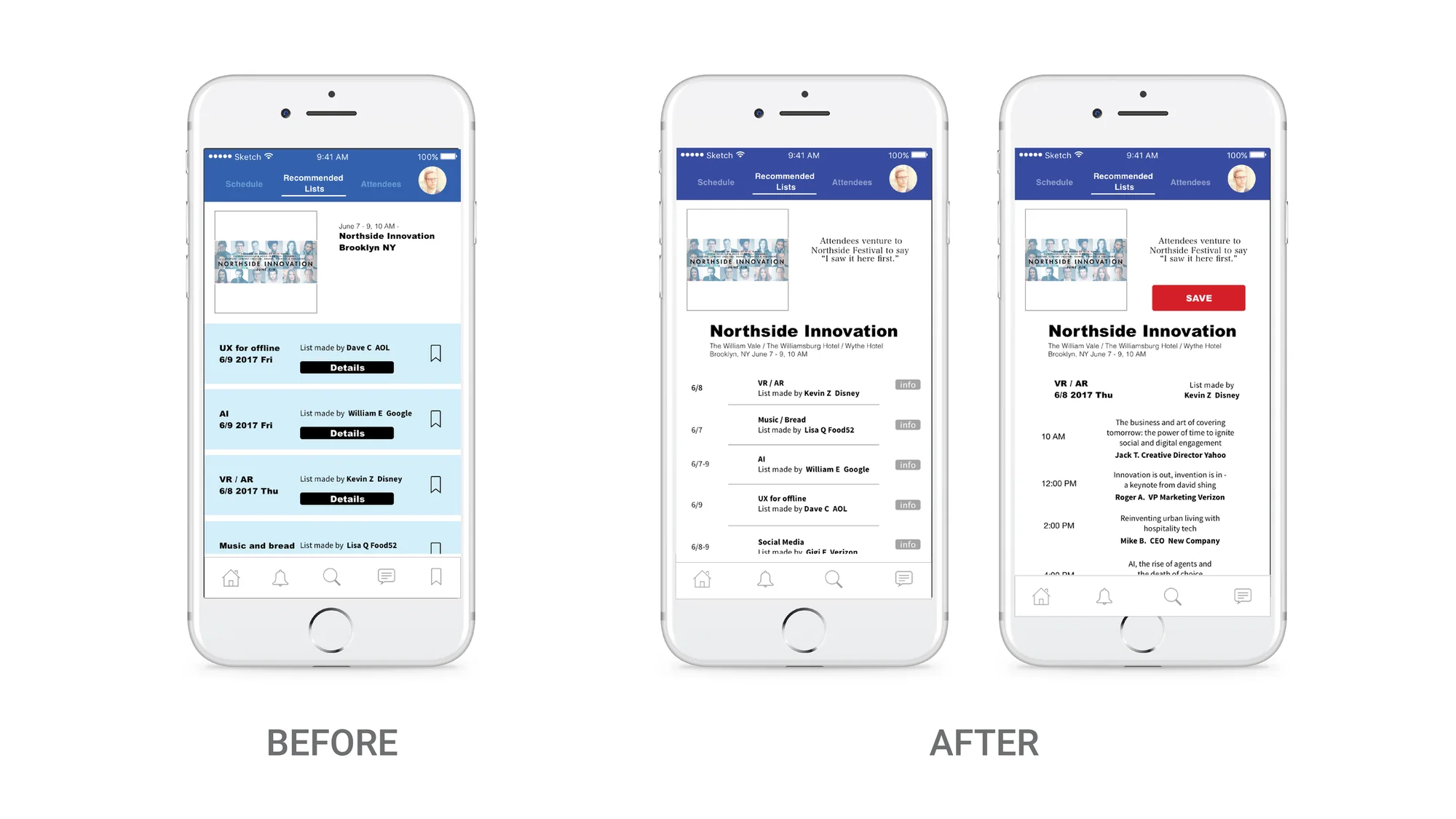
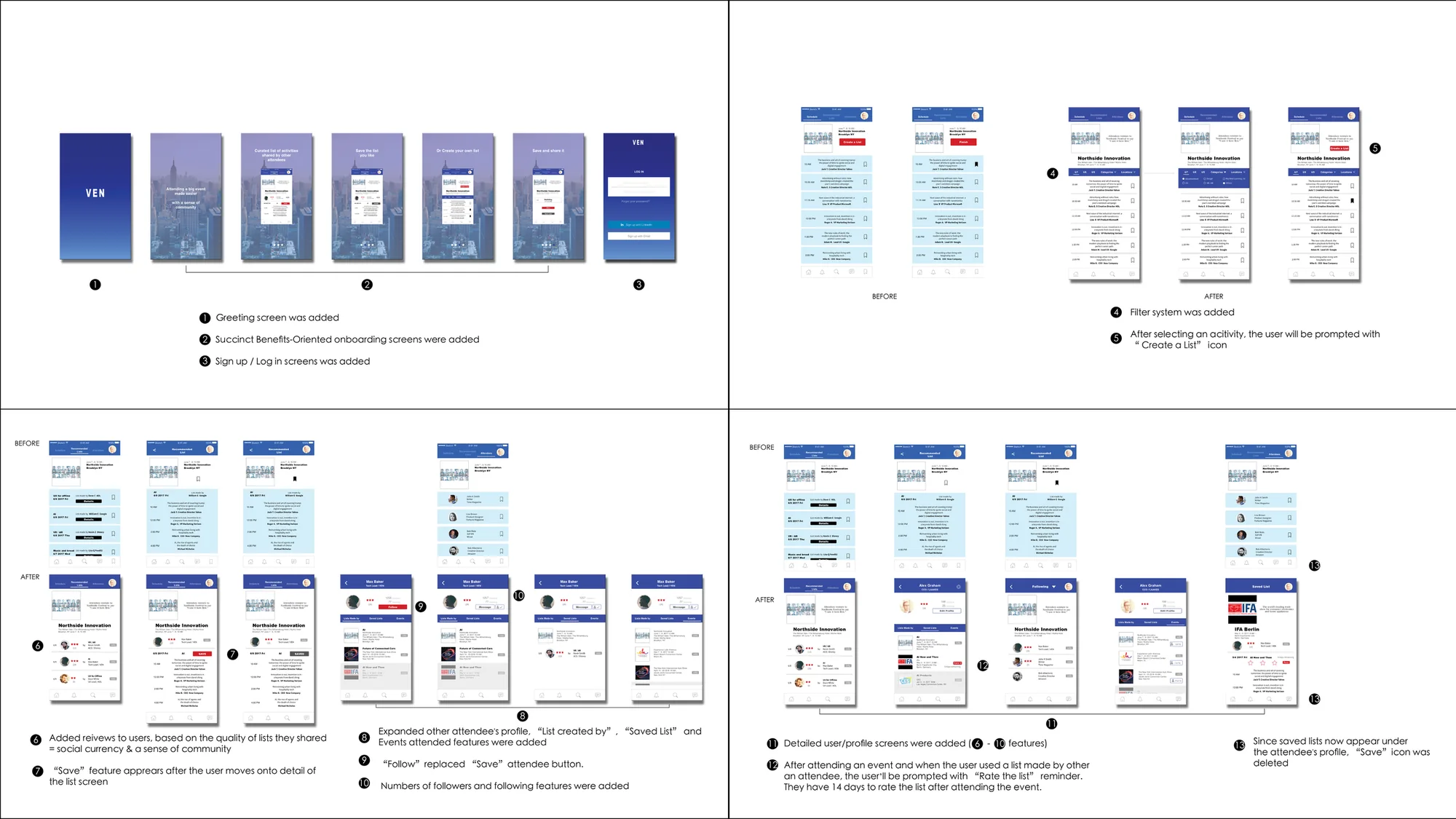
As shown below, more details were adjusted. One of them was the reminder for “Rate the list”; this is a unique feature that will encourage the users to help foster a better community.
Vision
Creating a list of activities for a big trade show takes time even for industry experts. Those who share a useful list with other attendees deserve social currency, so VEN has a review feature to encourage attendees to create and share. Your professional identity provides a good measure of credentials but the review feature further ensures the quality of the list. Also, less established attendees have a chance to earn social currency on the same platform as the more established.
Brand Voice
Succinct and friendly
What’s Next
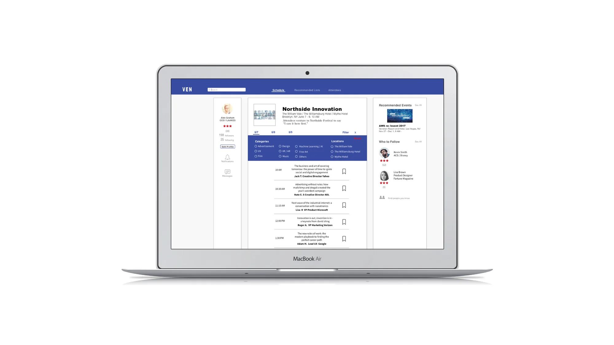
An app is necessary for on-the-go users, but the next step is to create a fully developed website. The users who create a plan would most likely prefer to be seated for such a time-consuming activity, and having more information real estate will be beneficial to accomplish a task such as this.